Visualize Your Findings

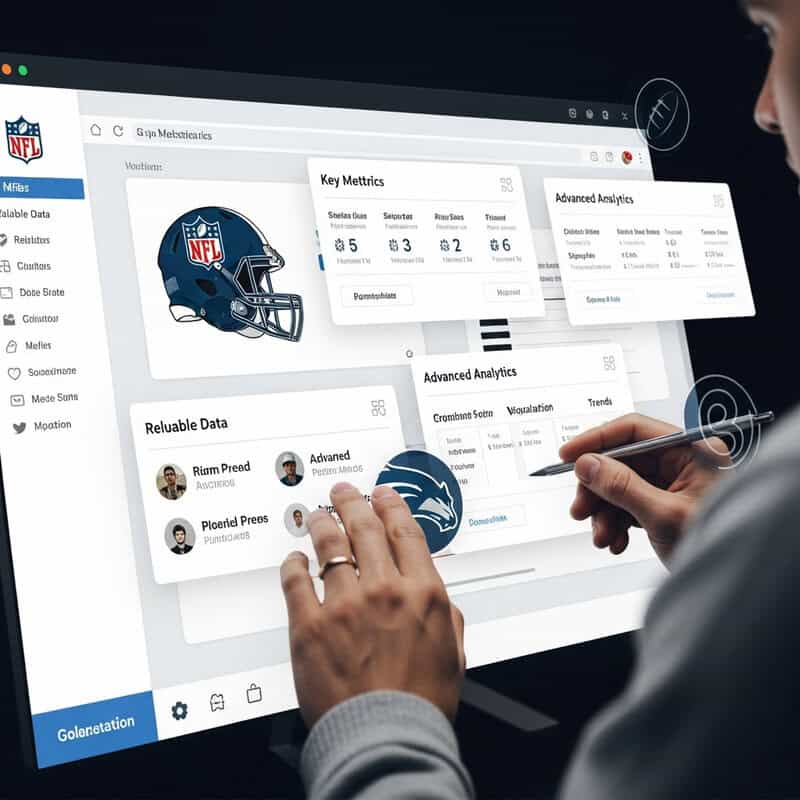
Transforming raw NFL stats into visual formats makes complex data much easier to interpret and share. Use charts and graphs to highlight comparisons, trends, and standout performances. Tools like Tableau Public and Microsoft Excel enable you to create interactive dashboards, heat maps, and line graphs for game-by-game or season-long analysis.
Effective visualizations not only clarify your findings but also make presentations more engaging for others. Experiment with different formats to best showcase the insights you’ve uncovered in your NFL stat analysis.